Making data work for IT: Introducing HP’s Workforce Experience Platform

Employees expect the freedom to work anywhere, anytime. At the same time IT teams are stretched thin. Without a unified way to manage fleet health, software usage, and employee experience, issues go unresolved and productivity suffers.
HP’s Workforce Experience Platform (WXP) is an enterprise SaaS solution that gives IT a single source of truth. By transforming telemetry data into real-time insights, WXP enables IT teams to detect problems early, take action at scale, and enhance the digital employee experience across their entire workforce.
This case study spotlights the design team’s overall design process, research approach, and systemic design execution. It also highlights a cornerstone research initiative centered on the Home page, showing how the team partnered closely with beta customers to iterate improvements and deliver a user-centered experience that met their needs.
With a fast-paced timeline of 18 months from kick-off to global release, the design team ensured user research and the voice of the customer stayed at the center of building the experience. After 40 research studies and 143 hours of user interviews, the team proved that user research can drive product and design direction without slowing development.
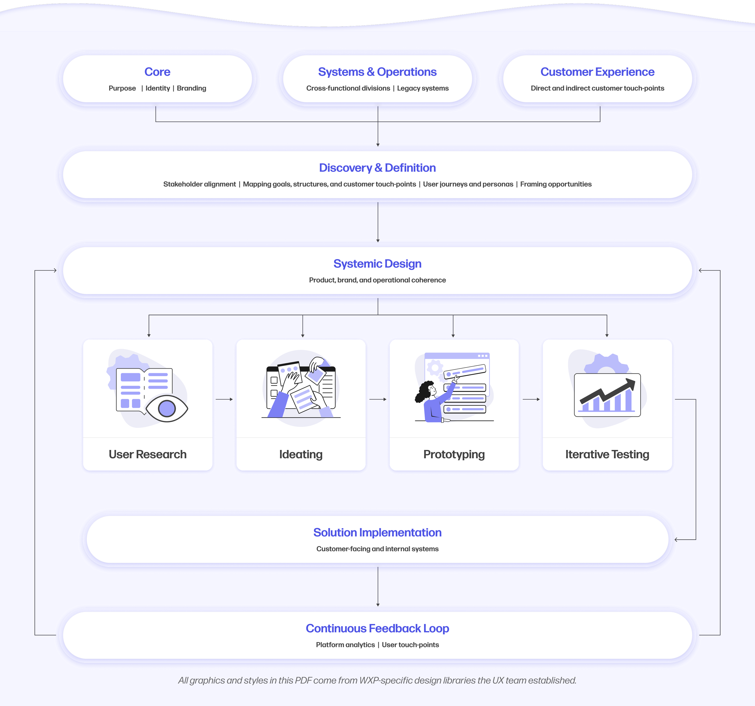
Design process
The design process operated in three key dimensions: the purpose and identity of the organization, the systems and operations behind the platform, and the experiences delivered to customers.
The team began by aligning stakeholders across departments and mapping user touchpoints alongside HP’s goals and structures. From there they framed opportunities that would connect internal capabilities with external needs. Design work progressed systemically, ensuring product, brand, and operations were in sync before solutions were implemented. This applied across both customer-facing and internal systems.
Throughout the process they maintained core design practices such as user research, prototyping, and iterative testing. Continuous feedback loops helped the team evolve both WXP and HP itself, ensuring adaptability, ongoing innovation, and alignment across functions.
Research methodologies
To make WXP truly useful, the design team built it alongside users and had them test the experience against real-world pain points. The research program gathered both qualitative and quantitative insights. Participants included IT teams who would buy WXP directly and partners who sell HP hardware and software to the small and medium companies they advise or manage.

Research methodologies were tailored to the hypotheses or questions the team needed answered. During both private and public beta phases, early-adopter organizations joined the platform at no cost in exchange for feedback. Studies included interviews, card sorting, and usability sessions to guide information architecture and workflow design.
The design team relied on a wide range of research tools to make sure insights were captured efficiently and applied effectively. Marvin automated the heavy lift of analyzing interview data by turning over 140 hours of recordings into clear insights the team could act on quickly. Sprig provided the ability to run usability studies, surveys, and A/B testing so the team could capture both qualitative and quantitative feedback with confidence. User Interviews helped bring in the right participants from WXP’s target audience for live sessions and surveys, while UserTesting supported structured studies like card sorting to refine terminology and information architecture. Miro acted as the team’s virtual whiteboard, enabling brainstorming, research mapping, and workshop collaboration for a mostly remote group. Finally, Figma played a dual role as both the primary design tool and the testing environment, allowing the team to prototype, iterate, and validate ideas directly with users in real time. Together, these tools created a cohesive ecosystem that kept research, design, and collaboration closely connected.
Beta participants
A sample of customers who participated in the Private Beta and Public Beta phases.

Research spotlight: Home page
Enterprise IT teams rely on dashboards to quickly assess fleet health, identify issues, and act. Early versions of the WXP dashboard offered high-level information but lacked context and detail, making it difficult for users to spot specific, high-priority problems.
The goal was to transform the Home page into a clear and action-oriented experience that helps IT teams prioritize issues, understand impact, and respond with confidence at scale.
Research methods
Most qualitative insights came from group and 1:1 interviews, supplemented with quantitative studies such as card sorting to refine navigation and information hierarchy. Over the course of private and public betas, several rounds of research shaped the Home page into its final form.
Previous home dashboard
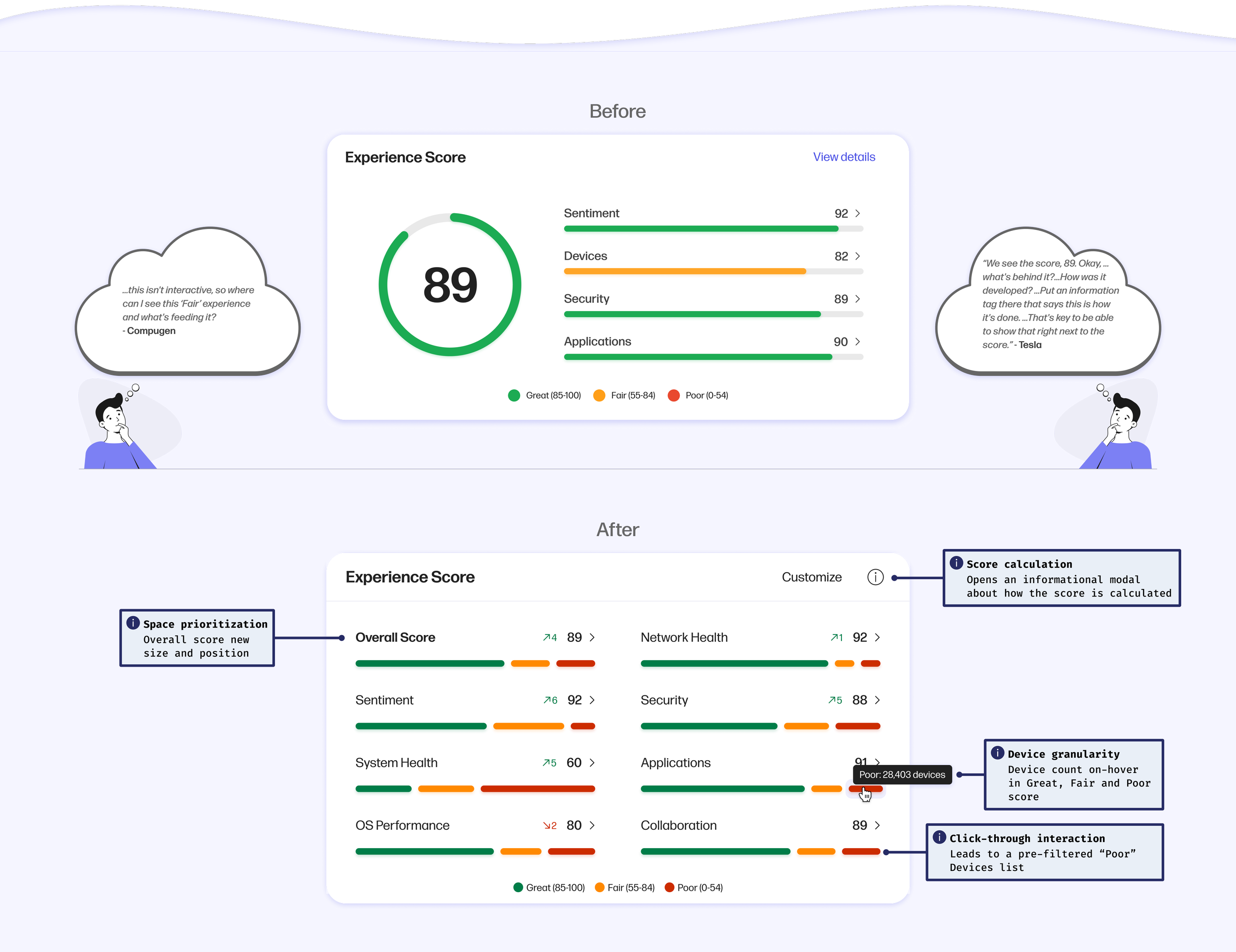
In the private beta, the Home page presented an initial layout that still needed validation. Key elements like the Experience Score widget and Recommended Actions required testing to confirm if they truly met user needs.

Experience Score widget
User feedback revealed two major problems. First, the content felt too general and failed to surface specific employee experience issues. Second, the large numeric score confused users because they didn’t know how it was calculated or what it really meant.
The team redesigned the widget with a segmented breakdown of employees having great, fair, or poor experiences. They reduced the emphasis on the overall score and added more detailed sub-scores, along with an info icon to explain the formula. They also gave users the ability to adjust the formula by weighting categories differently.
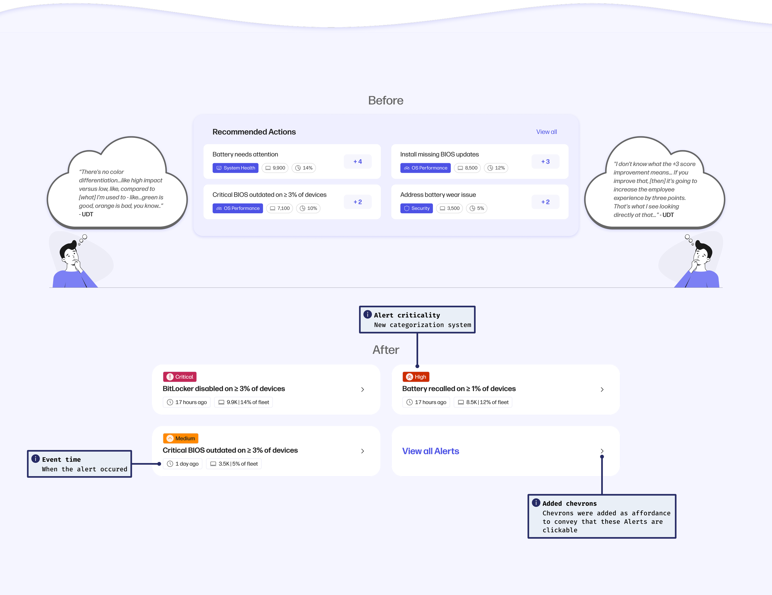
Turning Recommended Actions into Alerts
User feedback on Alerts pointed to issues with color and visibility. The first design used a monochromatic approach to avoid the noise of legacy dashboards, but it went too far. Users couldn’t tell which issues were critical. The redesign added system colors and criticality tags so users could quickly see what needed attention.
The team also replaced confusing projected score numbers with clearer context about when alerts occurred. Category tags that had been styled in blue were dropped because they didn’t help decision-making and only added unnecessary visual weight.
Updated dashboard
By the time of the global rollout in April 2025, the Home page reflected these changes and many other refinements. The Experience Score widget and Alerts became pivotal in shaping a clearer, more actionable dashboard directly informed by customer feedback.

Key Takeaways and next steps
The Home page initiative showed that testing early and iterating with user input greatly increases efficiency and reduces costs.
For the second half of 2025, the design team is running validation studies to explore deeper customization of both the Experience Score and Alerts, as well as enabling users to build a fully personalized Home page through WXP’s dashboard feature.
Applying research at scale
The high volume of research during beta phases created a challenge: how to apply insights consistently across a growing platform. The solution was a robust system of design libraries in Figma, ensuring user feedback could move seamlessly from insights to implementation.
Design Libraries
For Workforce Experience, the design team created four main design libraries in Figma for their designers to leverage: Components, Templates, Illustration, and Data Visualization. Segregating their libraries ensures they can scale each over time as the platform grows and each will remain performant in terms of memory usage.
Component library
The component library includes all of the custom components the team created specifically for the Workforce Experience Platform. This library currently contains 40 custom components and is steadily growing with the platform.
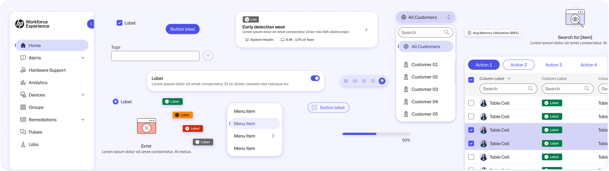
Template library
Common components are helpful in fostering a cohesive user experience in the team’s designs, but their template library truly helped them achieve an unprecedently level of consistency in their experiences and mitigate arbitrary differences in the user interface.
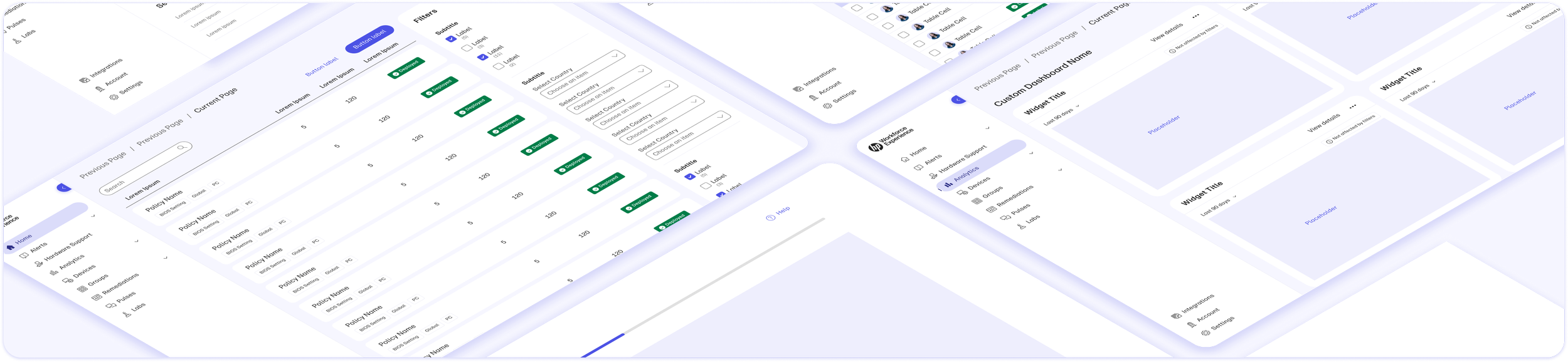
Illustration library
The team also designed a robust illustration library to compliment their user interface and to create a visually inviting, fun aesthetic that both conveys WXP’s personality while remaining functional in terms of providing visuals to aid key workflows.

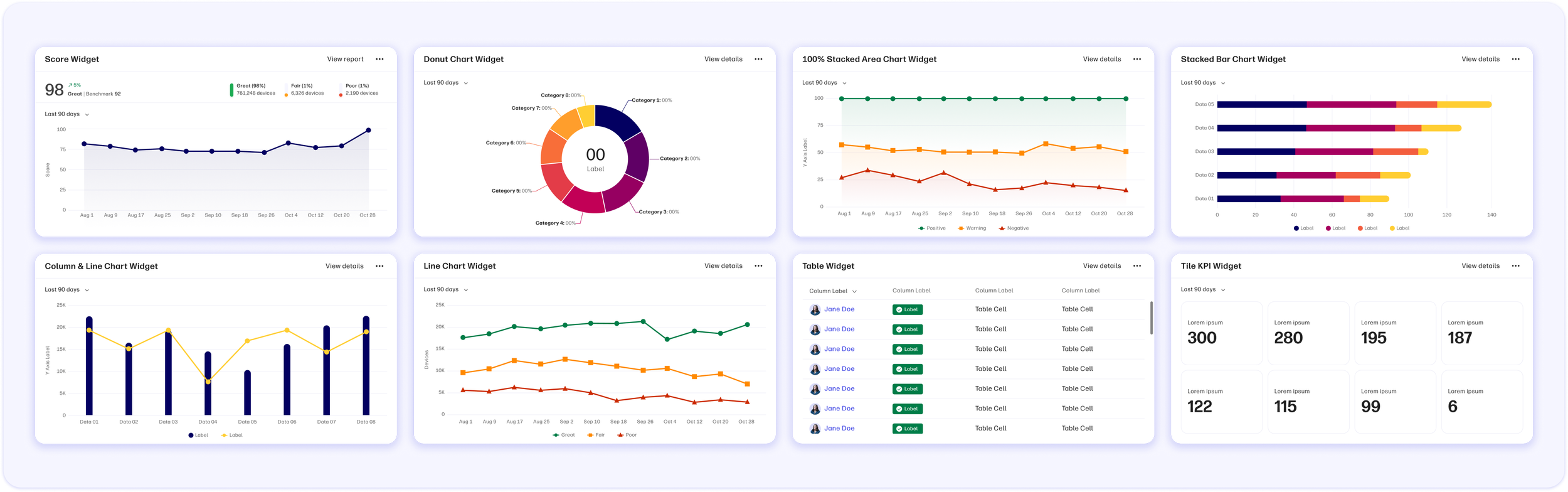
Data Visualization library
Lastly, the team’s data visualization library powers all of their charts and widgets on the platform. What’s special about this library is that all of the charts are resizable with auto-layout and can instantly swap from light to dark with the press of a button, enabling their designers to produce data visualization assets with efficiency and precision.
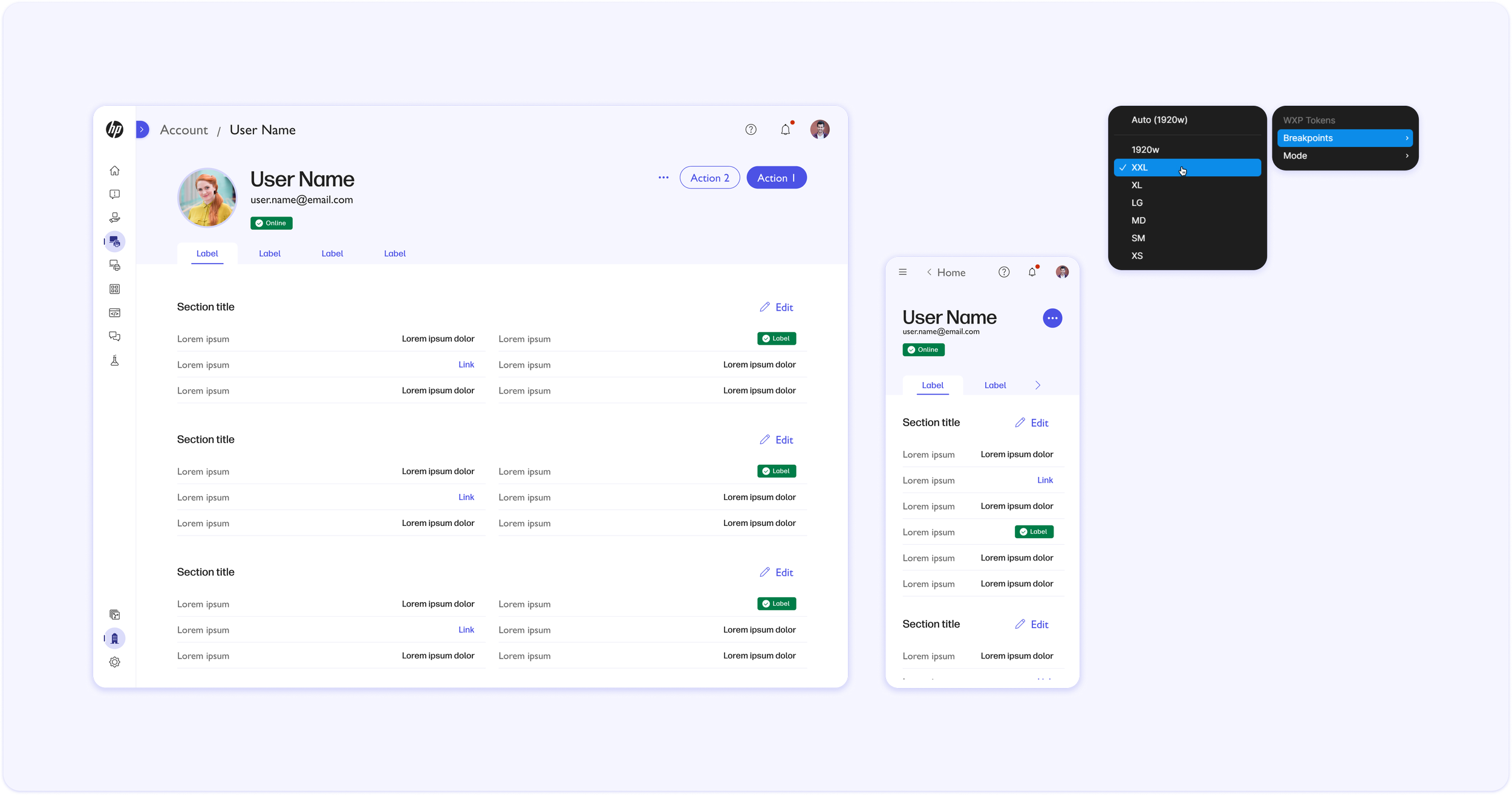
Theming and responsive design
Workforce Experience fully supports theming with Light and Dark modes for all of the design team’s tokens, components, templates, illustrations, and data visualization. Using Figma Variables, their designers are able to convert designs instantly from Light to Dark without the need for manual adjustment.

The team built the Workforce Experience Platform to support responsive design, and their library templates automatically adapt to various form factors and screen sizes by leveraging Figma’s Variables and Auto-Layout features. This efficiency operationalized responsive design across the team and helped mitigate the margin for error in their deliverables.
Next steps for the Workforce Experience Platform
Following WXP’s global rollout on April, 30th 2025, the design team is closely monitoring usage analytics on the platform and drafting research priorities for the second half of this year. During WXP’s beta programs, the design team captured a wide-range of qualitative research from 1:1 interviews with participants, and now that the product is globally available and traffic to the site is growing rapidly by the day, the team is collecting a larger ratio of quantitative data and tracking key metrics like page views, conversion percentages, session durations, and much more. Going forward, the design team intends to drive product direction and design decisions by combining both qualitative insights from user interviews and quantitative metrics from usage analytics, evolving the platform while keeping users at the center of everything they do.
